Most small trades look like three different companies.
There's the one on the board outside the job, the one on the business card, and the one on the website. Each was made at a different time, often by a different person, and each picked its own shade of blue. Nobody planned it. It just happened one order at a time.
Customers notice, even if they couldn't tell you what they noticed. A neighbour sees your board, looks you up that evening, and lands on a site that feels like someone else. A small doubt creeps in. Small doubts are what lose quotes.
We've just been through this with one of our own clients, so we'll walk you through it.
The business
JJS Electrical Solutions is a NAPIT-registered electrical team in Chaddesden, Derby. Josh started on the tools at sixteen, did his apprenticeship, went out on his own after the pandemic and has grown it into a team covering Derby and Derbyshire. Rewires, fuse boxes, EV chargers, fault finding, safety checks.
The reputation was already there: 4.9 stars from 46 Google reviews. The job was to make sure a stranger could see that from the very first look.
Settle the rules in one place first
For JJS, that place was the website, because we were rebuilding it anyway. For your business it might be a new sign, a van or a fresh set of cards. What matters is that the decisions get made once, properly, and everything else follows them.
A website is a good place to do it, because it forces every decision. What do you lead with? What proof do you show? What's the one thing you want someone to do? On a business card you can skip those questions. On a website you can't, because the page just doesn't work.
So while we rebuilt the JJS site, we settled four decisions.
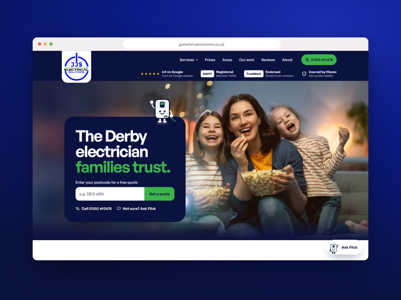
Prices on the page. Most trades sites hide their prices. Every JJS service shows one: a full rewire from £3,500 plus VAT, a fuse box from £650 plus VAT. That puts some people off, and that's fine. The ones who ring already know roughly what to expect, so nobody's time gets wasted.
Proof before the scroll. The Google rating, NAPIT membership, TrustMark and insurance sit at the top of every page. Nobody should have to go looking for the reason to trust you.
One question to start. The first screen asks for a postcode, nothing else. The quote tool takes it from there.
Something to remember them by. Most electricians' logos are some shade of blue with a lightning bolt in it. JJS has Flick, a fuse box with a face, who guides people round the site. You can't remember a lightning bolt. You can remember Flick.
Then redesign the print from it
We designed JJS's first print when they were starting out, before there was any brand guide. That's normal for a new business, and it meant each piece was made on its own, with its own blue, its own typeface and its own contact details.
Their logo came with no brand guidance, so while we built the website we refined the brand around it and wrote the rules down. So we didn't start the print again from scratch. We redrew the set using the website's rules: the same navy, the same type, green on one phrase only, the full-colour logo, and Flick. That's the whole trick. The website already holds every decision, so the print just follows it. The new set is designed and ready for their next print run.
A few things changed along the way that are worth copying.
One phone number and one email, everywhere. The same ones as the website. If you have a mobile, a landline and two email addresses spread across your print, pick one of each and stick to it. Every extra choice is somewhere for a customer to go wrong.
Your strongest idea goes on everything. Prices up front was the website's best idea, so it went on the business card and the advert too. If something works online, don't leave it there.
The review card asks for one thing. JJS's name first, Google second, and a QR code big enough to scan without thinking. A review card that makes people hunt for the link doesn't get used.
Each piece gets its own QR code. Tracked separately, so JJS will be able to see which piece actually brings people to the website, rather than guessing.
Every piece hands on to the next
This is the part most businesses miss. Print isn't a set of separate items. It's a chain.
Here's how the new set is designed to work. The board outside a job is where a neighbour first hears the name. The website is where they check you out and ask for a quote. The business card is what Josh leaves behind after a visit, with a price written on it and a code that goes straight back to the prices online. And the review card, left once the job's done, asks for the Google review that makes the website more convincing to the next person.
Each piece has one job: get someone to the next step. When they all look like the same company, that hand-off feels natural. When they don't, every step is a chance for someone to wonder whether they've got the right firm.
What to take from this
You don't need a new website to start. Line up your board, your card and a screenshot of your homepage, and ask whether they look like one business.
If they don't, pick one of everything: one logo, one colour, one phone number, one email. Then change the pieces one at a time as they need reprinting. A reprint that matches costs the same as one that doesn't.
If you'd rather hand the whole thing over, that's what we did for JJS. One team for the website and the print, so they come out matching. You can see the full case study, their first set and the new one, on our site.
Three companies, or one. Your customers can tell which you are.