There's a reason banknotes look the way they do.
The fine engraved lines, the looping guilloché borders, the formal type and the crests started out as security: they're hard to fake. Over time they came to mean something else as well. Permanence. Trust. Something made with care.
That's why more brands are borrowing the look for their own print. Done well, it makes a business card feel like it's worth keeping. Done badly, it looks like clip art.
Who it suits
This is a look for businesses that trade on trust and want to be seen as here for the long run:
- Accountants, financial advisers and wealth managers.
- Solicitors, architects and consultancies.
- Restaurants, bars, hotels and members' clubs with a heritage feel.
- Spirits, watches, fragrance and other premium products.
It's a harder fit for brands that sell speed, play or price. A guilloché border on a takeaway menu is trying too hard.
Where it works best
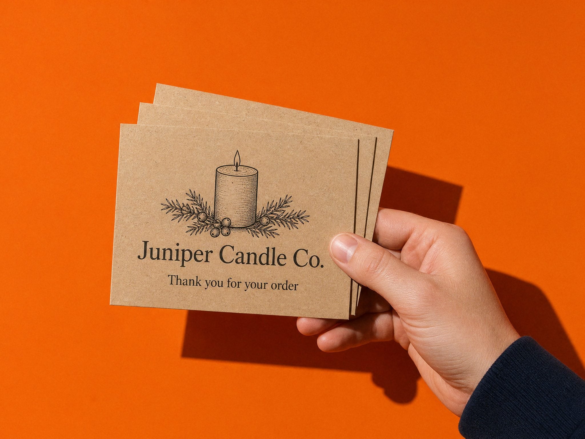
Business cards. This is where the look earns its keep, because people hold the card close and turn it over. A square card suits it well: the symmetry gives a central crest or seal room to sit inside a border. Metallic foil on a soft-touch card gives you the gold or copper of an engraved note without trying to fake it in ink.
Stationery. Letterheads, compliment slips and certificates, anything that's meant to look official.
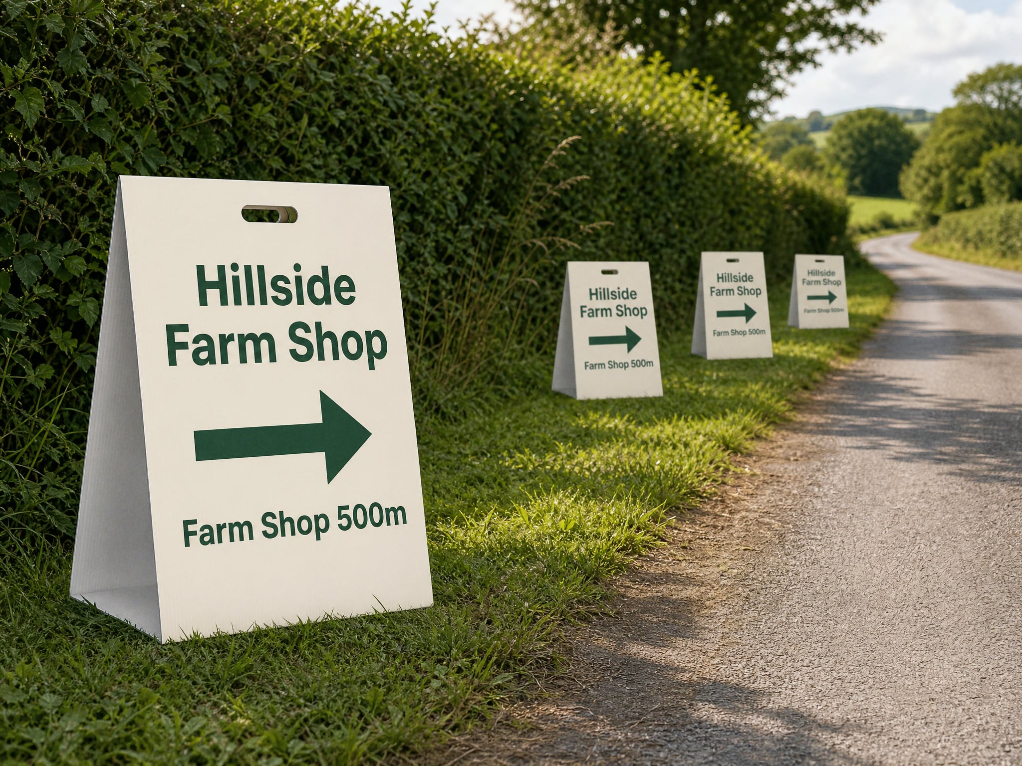
Signs, and only simplified. On an A-board or a flag the fine detail is lost at a distance, so use the bold parts of the look (a strong crest, a ruled border, formal type) and save the intricate linework for things people hold.
Keep it honest
True engraving and intaglio printing are specialist processes, and they're priced like it. What most brands are really after is the look, reproduced well in normal print and foil. That's fine, as long as you design for what you're actually printing.
A few rules that keep it from tipping into pastiche:
- Pick one or two elements, a border and a crest say, not every banknote trope at once.
- Use a restrained palette: one deep colour, cream or white, and one metallic at most.
- Let the type do the formal work. A well-set serif carries more authority than another layer of pattern.
- Don't use real currency imagery or anything that could be mistaken for money. Banknote designs are protected, and it's not the point anyway.
Set the file up so the detail survives
This look is unforgiving at the press. Fine lines that look crisp on screen can thin out, fill in or vanish. Before you send it:
- Line weight. Keep the finest lines at 0.25pt or heavier. Thinner than that and they can drop out.
- Vector, not pixels. Supply linework and borders as vector artwork. If anything is a photo or scan, it needs to be at least 300dpi at the printed size.
- Colour. Set the file up in CMYK. Golds in particular look very different on screen and on paper, which is one reason foil often works better than gold ink.
- Bleed and safe area. Borders tend to run close to the edge. Add 3mm bleed and keep the border's inner line comfortably inside the trim, or a slightly uneven cut will show.
- Fonts. Outline or embed them, so a formal serif doesn't get swapped for something else.
We check every file by hand before it prints, and with this kind of design we'll look closely at the thinnest lines. If something's likely to disappear, we'll tell you before it does.
The test
Hold the proof at arm's length, then right up close. From a distance it should read as one calm, confident mark. Up close it should reward a second look. If it only works one way, simplify until it works both.