Most articles about C-Type prints try to convince you C-Type is "better than Giclée." It isn't, and it doesn't need to be.
C-Type and Giclée serve different purposes. C-Type is the right choice when the work needs to read as photography. Giclée is the right choice when the work needs to read as fine art reproduction. The question isn't which is superior. It's which one the work itself is asking for.
This is a working photographer's guide to choosing C-Type, the four Fuji finishes we offer, and what makes a C-Type order land properly. Written from the print supplier's side of the brief, where we see what photographers actually run into.
What C-Type actually is (briefly)
Most of our customers ordering C-Type already know this, but for the sake of completeness: a C-Type print is a chromogenic print, made by exposing photographic paper (silver halide emulsion) to RGB laser light and chemically processing it. The image is formed within the paper's emulsion layers, not deposited on top.
The practical consequence is that a C-Type print is a photograph, not a print of a photograph. There's no visible dot structure, no surface ink, no texture from a printing pass. Tones are continuous because they're chemically continuous.
If you want the longer technical version, Fuji's own documentation on Crystal Archive papers covers it thoroughly. We'd rather use the space here to talk about choosing.
When C-Type is the right call
C-Type suits work that's photographic in nature and wants to be presented as such.
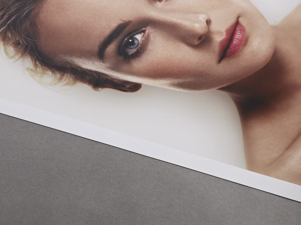
- Editorial and commercial portraiture. Skin tones are where C-Type really earns its place. The chromogenic process renders gradients and subtle tonal shifts in a way inkjet still struggles to match at the same scale.
- Wedding and family photography deliverables. Clients expect a "real photograph" feel. C-Type gives them that without explanation needed.
- Gallery editions of photographic work. Especially editions where every print needs to match every other print from the same file. C-Type is repeatable in a way large-run inkjet isn't.
- Backlit displays. Fuji Flex specifically, more on that below.

When C-Type isn't the right call
This is the part most C-Type articles skip.
- Fine art work that wants a paper character. If part of the work's identity is the texture, weight, and feel of a baryta, hot-press, or cotton rag paper, C-Type can't give you that. Giclée on the right fine art paper is the right call.
- Long-edition archival commissions where 100+ year display life is contractually required. Premium pigment Giclée on archival fine art paper can outperform C-Type on paper-rated longevity. Both are excellent; the spec sheet is the deciding factor.
- Very large-scale photographic murals where seams aren't acceptable. C-Type roll widths cap out at certain sizes; for some commercial wall installations, large-format inkjet on photo-grade media is the practical answer.
The four Fuji finishes, and which suits what
We offer all four standard Fuji Crystal Archive professional papers. They aren't interchangeable.
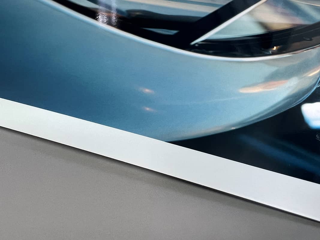
Fuji Gloss. High saturation, strong contrast, no surface texture. The classic commercial portrait and editorial finish. It's also unforgiving of dust and fingerprints during handling, so framing or mounting matters more here than with other finishes.
Fuji Matt. Reduced surface reflection, softer rendering, anti-glare. The practical choice for prints going into brightly lit interiors, retail environments, or anywhere ceiling lights or windows will compromise a gloss surface. Lower perceived saturation than gloss; the same image will look quieter on matt.
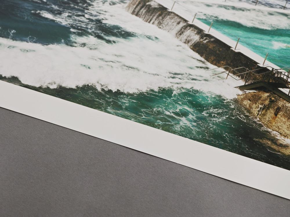
Fuji Pearl. Semi-gloss with a subtle micro-texture. Sits between gloss and matt, offering more saturation than matt but less reflection than gloss. Popular for landscape, fine art photography, and gallery exhibition work where the image needs depth without surface glare.
Fuji Flex. Flexible base rather than rigid resin-coated. Designed for backlit lightbox displays, frames that need the print stretched, or applications where the standard RC base is too rigid. Not the right finish for standard framed display; the rigid finishes do that job better.
If you're uncertain which to specify, the working defaults are: Pearl for gallery and considered display work, Gloss for commercial portraiture, Matt for spaces with difficult lighting, Flex for backlit only.
What about archival life?
The widely cited figures for C-Type are around 56 years on display in museum conditions and up to 100 years in dark storage. Those numbers come from Wilhelm Imaging Research and are based on specific conditions (UV-filtered glazing, controlled humidity and temperature, stable environment).
The honest version: in standard domestic display conditions without UV-filtered glass, expect a more practical 25 to 40 years before noticeable shift. UV light is what kills C-Type prints faster than anything else. If archival display matters, the framing spec matters as much as the paper choice.
When delivering work to clients, it's worth flagging the framing requirements that protect the print. We see photographers lose work to client framing decisions surprisingly often.
What makes a C-Type order land properly
A few things that come up in real orders.
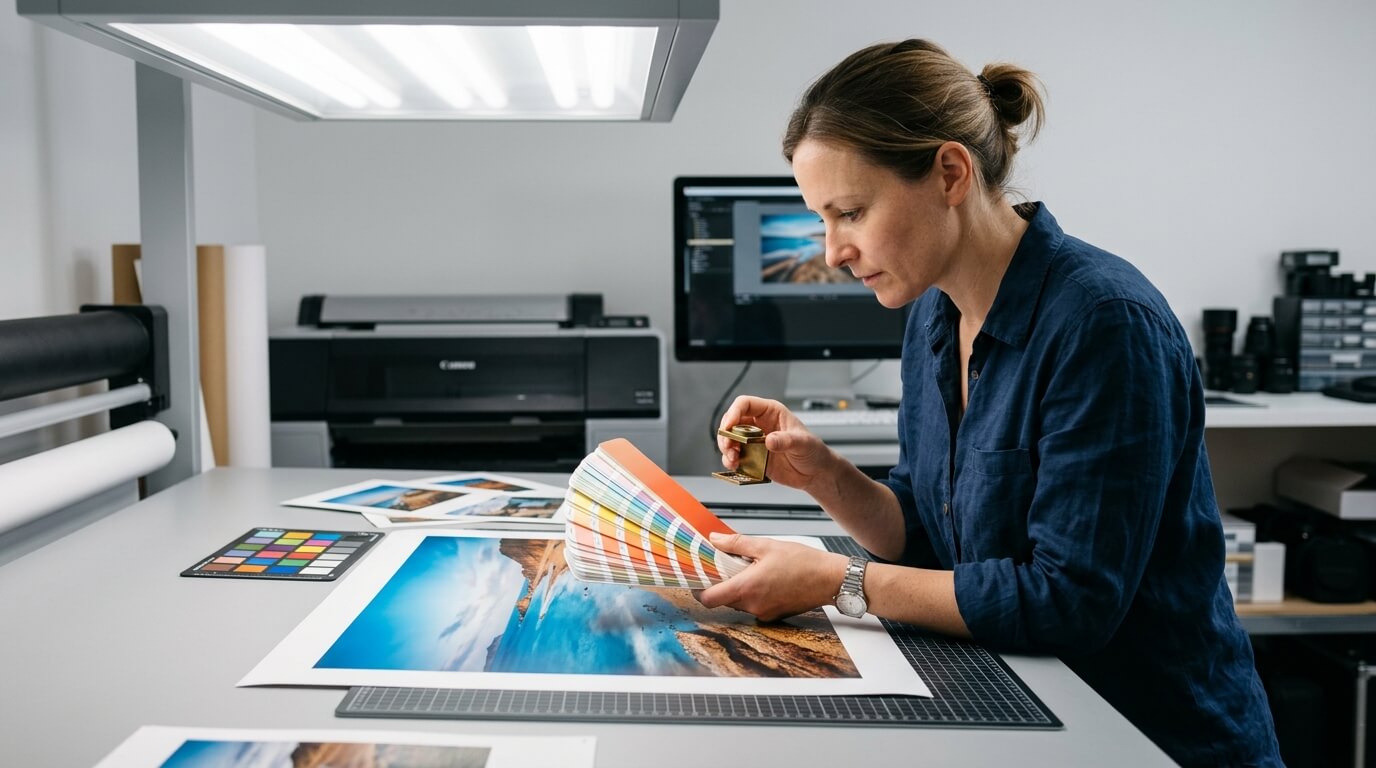
Soft proofing matters. C-Type colour gamut isn't identical to your monitor or your inkjet proofs. If colour accuracy is critical, soft proof against an appropriate ICC profile before sending the file. We can supply ours.
File specs matter more than for inkjet. C-Type doesn't have the same dot-error margins inkjet does. A file that prints acceptably on inkjet might show banding or edge artefacts on C-Type. Smooth gradients especially benefit from full-bit-depth files prepared properly.
Test print before edition. For editioned work, always run one or two test prints before committing to a full edition. This is true of any process, but with C-Type specifically, the chemistry can occasionally surprise you in ways that aren't visible on screen. Better to spend on two tests than reprint twenty.
Don't over-spec the paper. Pearl isn't automatically better than Gloss. The right finish depends on the work and the display environment, not the price. We've seen photographers default to the highest-tier finish reflexively when a more practical one would have served the work better.
What we do at Printlogik
We offer C-Type photo prints on all four Fuji Crystal Archive papers, with colour-managed production and the option to soft proof before committing. The orders we see range from single gallery editions to commercial commissions, and the questions photographers ask us most are the ones this article covers.
If you've got work you're planning to print and you want a second opinion on finish or spec before ordering, drop us a message. We'd rather get the brief right once than reprint it.
C-Type is a process worth respecting. It's been the photographic standard for decades because it does one thing very well. The trick is knowing when that one thing is exactly what your work needs.