Key Takeaways
- CMYK is the print-oriented colour model, designed around inks (Cyan, Magenta, Yellow, and Key/Black).
- RGB is the screen-oriented colour model, designed around light (Red, Green, Blue).
- What is CMYK vs RGB in practice comes down to conversions, colour profiles, and how much of the original range survives the move from screen to press.
- Consistent results in 2026 come from building files with the right intent, checking proof PDFs, and agreeing on finishes and paper types.
- We recommend supplying print-ready files and letting our team handle the final checks before production, not after.
Did You Know?
Color increases brand recognition by 80%, making accurate reproduction across print and digital media essential for visual identity.
Source: Insights4Print 2025
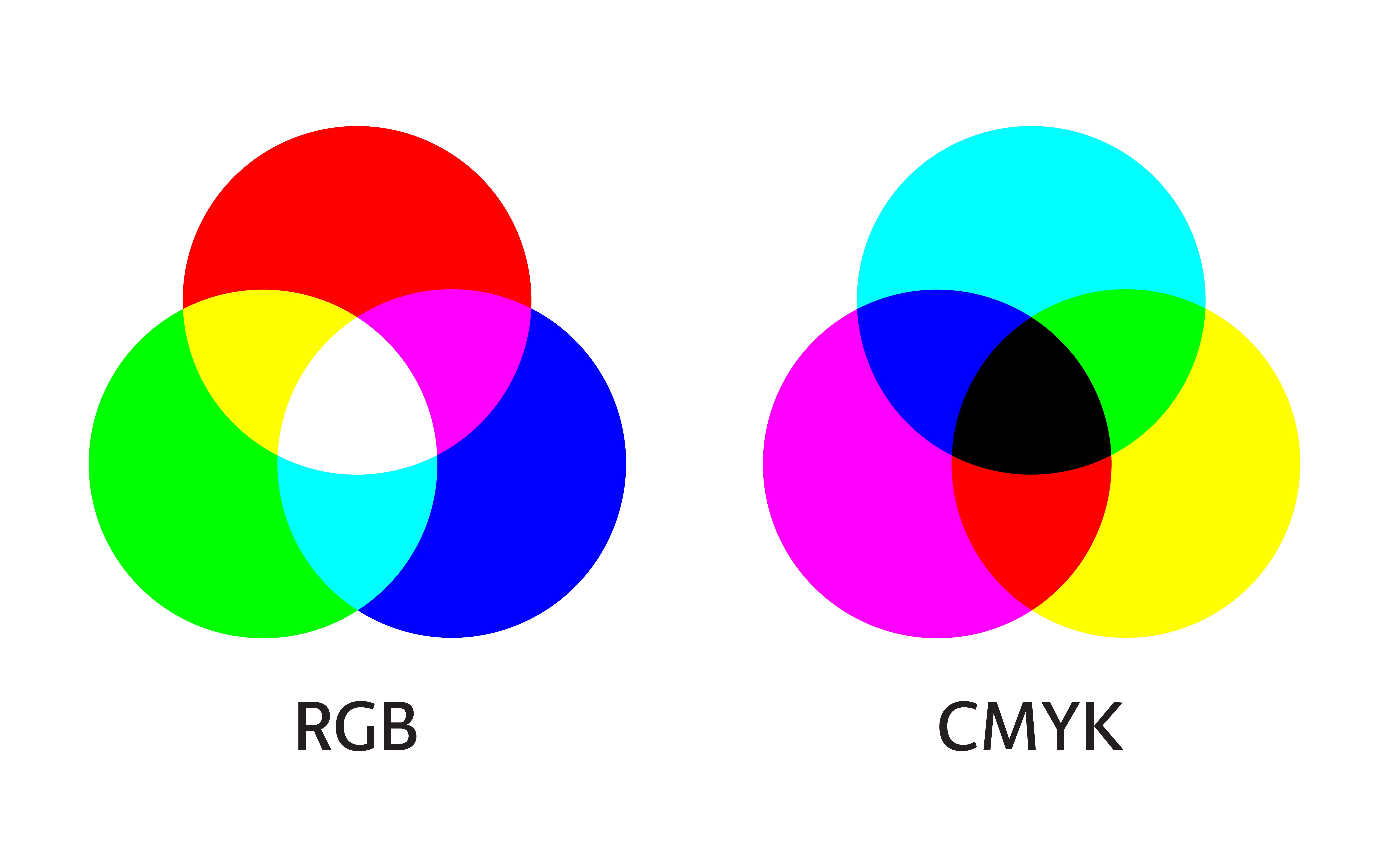
RGB vs CMYK: the simplest definition of each
When people ask What is CMYK vs RGB, they are usually trying to understand why the same design behaves differently on screen versus on paper. RGB and CMYK are both ways to describe colour, but they are built for different real-world technologies.
RGB (Red, Green, Blue) is built for light
RGB is how most screens create colour. A pixel mixes red, green, and blue light values to make the colour you see.
This is why RGB works naturally for websites, presentations, and screen previews. It is also why vivid blues and bright neon-like colours often look “great” on screen, yet do not always survive conversion to print.
CMYK (Cyan, Magenta, Yellow, Key/Black) is built for inks
CMYK is how printers typically think about colour. It uses ink percentages for cyan, magenta, and yellow, plus a key (black) component for depth, contrast, and efficient shadow detail.
In practical terms, CMYK prints through physical media, and physical inks have a different range than light on a display. That difference in “gamut” is a major reason for colour shifts.
What is CMYK vs RGB in real life? Screen colour to printed colour
What is CMYK vs RGB when you are actually trying to ship a job? It is the gap between how your file is interpreted by your design software (often RGB) and how it is interpreted by a print workflow (often CMYK, with a defined output profile).
In 2026, teams still run into the same core problems: files are exported in the wrong format, conversion happens late, and the proof does not match the final paper and finish. We see this across typical commercial print outputs like business cards, postcards, and folded leaflets.
Why colour shifts happen
- Different colour ranges: Some colours in RGB cannot be reproduced exactly in CMYK.
- Different colour management: The conversion depends on profiles, settings, and how the software interprets embedded data.
- Different production context: Paper brightness, coating, ink limits, and finishing (like lamination) change the final look.
- Late conversions: If the file is converted at the last moment, you lose control of the outcome.
What to check before you press “send”
- Confirm the colour model: Ask whether your artwork should be supplied as RGB or CMYK for your specific product.
- Agree on finish and stock: A glossy poster will reflect light differently than an uncoated flyer.
- Use proof PDFs: A PDF proof is your reality check for 2026 print production.
- Avoid “guessing” brand colours: If you have exact brand requirements, we will want a clear specification.
If you are building artwork around a brand palette, it helps to know that some items are more sensitive to colour changes than others. For example, the look of fine gradients and subtle skin tones can be easier to judge on high-resolution formats, while bold blocks of colour (like signage graphics) reveal conversion limits quickly.
When to use CMYK: common print projects
As a printing partner, we typically recommend CMYK for most standard print runs because it aligns with the way inks are applied and the way press output is profiled. This is especially important when your designs include brand colours, large flat areas, or strict visual guidelines.
In 2026, we often help customers make their artwork production-ready before it reaches the printer, including checks that focus on quality and compatibility. That is the difference between “it looked right on my screen” and “it looks right in the real world.”
CMYK fits best for:
- Business stationery where brand colour consistency matters, such as envelopes.
- Marketing leaflets and posters where colour blocks and typography need to hold up from viewing distance.
- Signage and display graphics, including magnetic vinyl signs and other durable outdoor or retail-ready applications.
- Laminated pieces where surface reflection changes how colours appear.
Signage and large-format colour considerations
For signs, gradients and brand blues are often where clients notice differences first. Even when the conversion is technically correct, the material and lighting conditions change the perceived colour. This is one reason we ask customers to share the intended use case, whether the design is for indoor counters or outdoor visibility.
If you want to explore signage outputs, our range includes signs, banners and displays and posters.
Did You Know?
What is CMYK vs RGB for print success? It is the difference between light-based screens and ink-based production, and mismatched colour handling is one of the most common reasons a “screen-perfect” design does not match the final print.
When to use RGB: digital-only and hybrid workflows
RGB is still the correct starting point when your deliverable is primarily digital. In a 2026 workflow, many teams keep creative masters in RGB so they can output to web, social, and presentations without repeated conversions.
That said, RGB does not automatically guarantee print accuracy. If you send RGB artwork to print without a clear conversion plan, the printer’s workflow will convert it, sometimes with settings you did not intend.
RGB is useful when:
- The design will be used online first, such as landing page banners and digital signage.
- You need vibrant on-screen colour and you will also create separate print-ready exports.
- Your content includes creative effects that you want to control before printing.
What to do if your brand files are RGB-first
If your artwork originates in RGB, we can still help you get to consistent print output. The key is not to treat conversion as an afterthought.
- Create a print-ready version that matches the target paper and finish.
- Check proof PDFs early enough to adjust colours without rushing.
- Ask for guidance on how we handle colour conversion for the specific print format.
This approach works well for teams producing both screen and physical outputs, such as campaigns that run across online ads and printed flyers.
If you are producing leaflet-style material, you may find it helpful to compare formats like flyers and leaflets and then decide where CMYK conversion and proofing matters most.
Proofing, profiles, and finishes: the part most people skip
To understand What is CMYK vs RGB, you need to go one step further than the colour model names. The real outcome depends on profiles, proofing, and how the final finish changes appearance.
Even when conversion is correct, colours can look different because paper absorbs ink differently and finishes reflect light differently. This is why laminated pieces can appear richer, while uncoated stocks can mute certain tones.
Finishes that affect perceived colour
- Lamination: Gloss or matt can change reflections and saturation.
- Coated vs uncoated paper: Coatings can intensify contrast and colour density.
- Viewing distance: Large signage is judged differently than small stationery.
- Lighting: Retail lighting, daylight, and overhead lighting shift how colours read.
We also see how production context affects output quality, which is why we offer free manual file checks where experts review artwork for quality and compatibility before it reaches production. That prevents many of the common issues that can show up after conversion.
Choosing between CMYK and RGB for your next Printlogik order
Our goal is simple, to make sure your final printed piece matches what you intended. When customers ask What is CMYK vs RGB, we treat it as a starting point and then guide them toward the best practical workflow for their product type.
For many print orders, CMYK is the safest target. For hybrid needs, we help you keep an RGB creative master while producing print-ready files that match the intended output conditions.
Practical next steps we recommend
- Tell us the product: business cards, postcards, posters, leaflets, or signage each has its own colour sensitivity.
- Share intended stock and finish: for example, if you are ordering folded leaflets and expect a particular look.
- Confirm brand colour expectations: if you have strict brand requirements, we will align your artwork handling to reduce surprises.
Examples of print items where colour decisions matter
When your deliverable includes fine art or photography, subtle tones can be affected by how the print workflow handles colour conversion. That makes it especially important for Giclée Fine Art Prints, where paper choice and accurate colour reproduction are part of the promise.
For event and brand identity touchpoints like customer printed lanyards, bold colour areas and brand text must stay readable and consistent under real-world lighting.
And for portable brand placements, magnetic vinyl signs need colour that holds up for roadside and indoor showroom viewing, not just on a monitor.
Conclusion
What is CMYK vs RGB comes down to this: RGB describes colour as light for screens, and CMYK describes colour as inks for print. In 2026, the most reliable way to avoid colour surprises is to treat conversion as part of the production workflow, not a last-minute fix, and to pair correct colour handling with proofing and finish selection.
If you want us to help you make the right calls for your specific product, start from your intended output on Printlogik, then use our guidance and checks so your final colour matches the intention, not just the screen.
Frequently Asked Questions
What is CMYK vs RGB, and which one should I use for my logo in 2026?
What is CMYK vs RGB is the difference between ink-based print colour (CMYK) and light-based screen colour (RGB). In 2026, many teams keep an RGB master for digital, but they still produce CMYK print-ready exports for anything going on paper so the final piece matches the intended brand look.
Why does my artwork look different on screen compared to a printed flyer?
The reason is the What is CMYK vs RGB gap, plus how colour conversion and profiles are applied. Screens use RGB light values, while printing mixes CMYK inks, and paper and finishes can shift the perceived saturation and contrast.
Can I upload RGB files to a printer, or do I need CMYK?
In many workflows, you can upload RGB files, but What is CMYK vs RGB still matters because the printer must convert them. For best consistency in 2026, we recommend confirming the expected colour handling for your specific product and proofing the PDF preview before production.
Is CMYK always duller than RGB?
Often, CMYK can appear less vibrant than RGB because it has a different colour range than screens. That is a direct outcome of What is CMYK vs RGB, where some bright screen colours fall outside what inks can reproduce.
How do I make sure my brand colours stay consistent between digital and print?
Start by understanding What is CMYK vs RGB, then manage the handoff with proof PDFs and agreed settings for the target paper and finish. If you have strict brand requirements, share them up front so we can align the artwork handling with your expectations.
Does lamination change CMYK or RGB colours?
Lamination does not change the underlying colour model by itself, but it changes how the printed CMYK inks reflect light on the surface. That is why the What is CMYK vs RGB conversation should always include finish, paper, and proofing so you see the look you will get in the real world.